At HosPortal we spend almost all our time making the best medical on-call rostering and clinical allocation software. But even we need a break sometimes, so we thought is might be fun to play another round of ‘Guess That Button’. Attentive readers will remember that the last time we played it was because we could not work out how to book a Covid vaccination using the new government-run website just at the time everyone was being encouraged to get one.
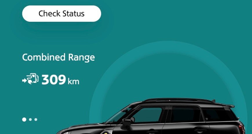
For this round of Guess That Button we encourage readers to review this screen from the Mini app. This phone-based app is provided to owners of Mini motor vehicles when you buy one of their…generously priced…cars. In this case the car is a plug-in hybrid that is currently attached to a charger. The app allows you to do all sorts of cool remote monitoring of your vehicle from suburbs away.
Of course, when charging a car one of the most common, important and useful things to know is whether your car has finished charging.
Your challenge, should you choose to accept it, is to find the button to tell you how well charged the car is. As a hint, and to allow you to use a process of elimination, there are buttons shown on the screen that:
Check the lock status of the car and either lock or unlock it remotely.
Activate the air conditioning.
Show the car’s instruction manual (but not the app instruction manual!).
Summon roadside assistance.
Allow you to read pages of marketing and view promotional videos for a vehicle you already own.
Check if the windows and sunroof are open.
See any service messages and whether the engine oil needs replacing.
Book a service.
Check the mileage/odometer of the car.
Check the status of the car – which is basically a summary of all the separate things listed above.
See our answers below.
Yes, you guessed it! The button you need is the image of the vehicle itself, which is the only thing on the screen that does not actually look like a button.
At HosPortal you will be pleased to know that we are easily frustrated by simple things like the bad design of this screen. So we try extra hard to make sure that our users do not suffer the same fate. Which makes for an easier and more intuitive user experience for our users, and fewer calls to our help desk.