Now even better on mobile
Readers will be aware that we have been critically reviewing the way HosPortal works on mobile devices. Most of the research is now complete, but in keeping with the usual high pace of our software development we have been making changes as we go.
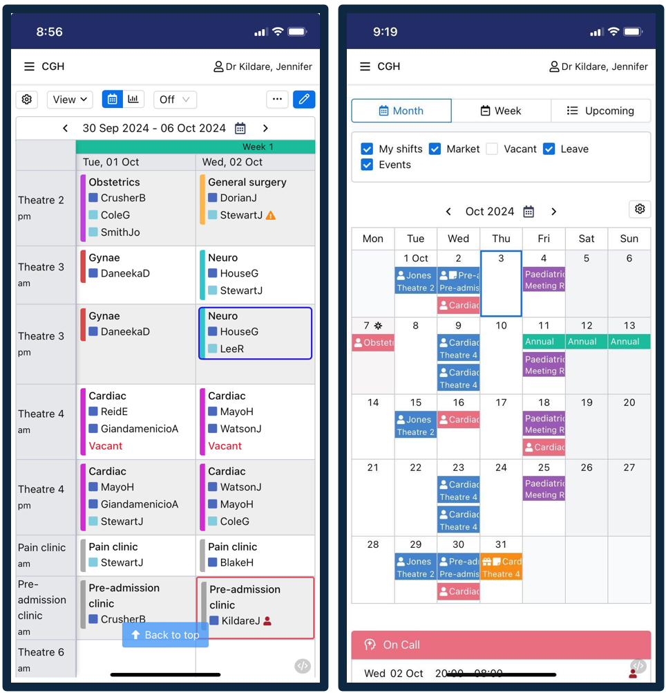
See a list of the major improvements below the screenshots…these are now all live and available to all users. Feel free to get in touch if you want to know more.
Particularly useful for roster administrators
Ability to lock row and column headers on large tables: sticky headers mean you will always know exactly what session you are looking at as you scroll over the week and over different locations and rosters.
Narrower row headings to free up more space for shift data, especially when views show more than one day. Session times and locations are collapsed to free up even more space.
Auto-scroll to the top of each page by using the ‘back to top’ single button press when you scroll deep into a page
For all users
Better ability for each user to customise their own dashboard/home page:
replace the shift ‘dots’ with more information about each shift
optional ability to show shift times and locations on the shifts
tick boxes that allow you to turn on and off various information (e.g. leave, events, vacant shifts, roster groups), and now moved to the top of the page
Better performance when going into ‘full screen’ mode.
All main pop-up and dialog boxes have been reviewed to make sure key information and buttons are easier to use on mobile devices, and review the way pop-up keyboards can sometimes interfere with other data.
Various other minor tweaks and improvements, like better re-rendering of screens when switching between portrait and landscape modes

